Using the SPPT to Monitor Changes in Crime
Since hotspots are a regular type of analysis crime analysts conduct, it is a natural question to want to see if they are changing over time. The most common way that analysts do this, often comparing kernel density estimates for an old vs a new sample (or sometimes using tests like ESRI’s emerging hotspot analysis tool, are prone to chasing the noise in my experience. That is, they tend to say things are changing based on trivial differences, when a more robust test that limited false positives would often say there are no changes over time.
Hotspots tend to be very temporally consistent. One can draw hotspots often decades old, and they do not change over time (Wheeler et al., 2016). So I often suggest analysts only look at hotspots over very long time periods. When slicing to just the last month there are often only a handful of incidents, but when aggregating over several years you often have 100s (if not 1000s) of data points to more accurately draw hotspots.
If you are interested in assessing change though, I suggest the SPPT (spatial point pattern test) (Wheeler et al., 2018). This was a test first created by Martin Andresen, and it is very simple. Imagine you have a set of areas, here for a simplified example we have three areas. I have counts of crime in the Pre time period, and counts of crime in the Post time period.
| Area | Pre | Post |
|---|---|---|
| A | 50 | 20 |
| B | 30 | 20 |
| C | 20 | 10 |
Andresen’s SPPT test compares the proportions in the two different sets. So say Post is data for the past twelve months, and Pre is data from the two priors prior to that. The test looks at the overall percentage in each set. So for area A, it went from 50% of the crimes, to 40% of the crimes. Area B went from 30% to 40%, so increased. And area C stayed the same, at 20% of the overall distribution in both time periods.
I have created methods to identify if these proportions are different over the two time periods, while taking into account the fact that you often test many different areas (Wheeler et al., 2018). In practice, the areas can be whatever you want them to be (like reporting or patrol districts). Using regular grid cells allows you to control how focused you are, while taking into account how sparse the data is.
One can see an example comparing changes to thefts from motor vehicles in Durham on my github. I show the analysis at quarter mile grid cells, and using data on thefts from motor vehicles for the pre period (2019 through 2023) compared to the post period (2024), identify 12 different quarter mile areas with significant increases. So even though the first row has *fewer* crimes in the post period, it is a much higher proportion. (Normalized to year, the pre time period has around 8 per year.) This technique, when comparing the relative distribution, makes it easy to compare point patterns that have different total values.
| GID | Pre | Post | PropC1 | PropC2 | Dif | q |
|---|---|---|---|---|---|---|
| 29 | 42 | 30 | 0.003 | 0.009 | 0.006 | 0.001 |
| 61 | 10 | 12 | 0.001 | 0.004 | 0.003 | 0.025 |
| 78 | 1 | 19 | 0.000 | 0.006 | 0.006 | 0.000 |
| 82 | 43 | 29 | 0.003 | 0.009 | 0.006 | 0.004 |
| 92 | 9 | 11 | 0.001 | 0.003 | 0.003 | 0.037 |
| 95 | 0 | 5 | 0.000 | 0.002 | 0.002 | 0.022 |
| 113 | 6 | 16 | 0.000 | 0.005 | 0.004 | 0.000 |
| 120 | 7 | 10 | 0.001 | 0.003 | 0.003 | 0.035 |
| 183 | 103 | 90 | 0.007 | 0.028 | 0.020 | 0.000 |
| 239 | 8 | 19 | 0.001 | 0.006 | 0.005 | 0.000 |
| 323 | 40 | 25 | 0.003 | 0.008 | 0.005 | 0.035 |
| 365 | 13 | 15 | 0.001 | 0.005 | 0.004 | 0.004 |
If one were to do the same analysis without correcting for multiple comparisons, the majority of the map would be filled in. Using this technique though, crime analysts can focus in on the areas that are showing the most change (either up or down) to dig into the patterns and see what is going on with trends.
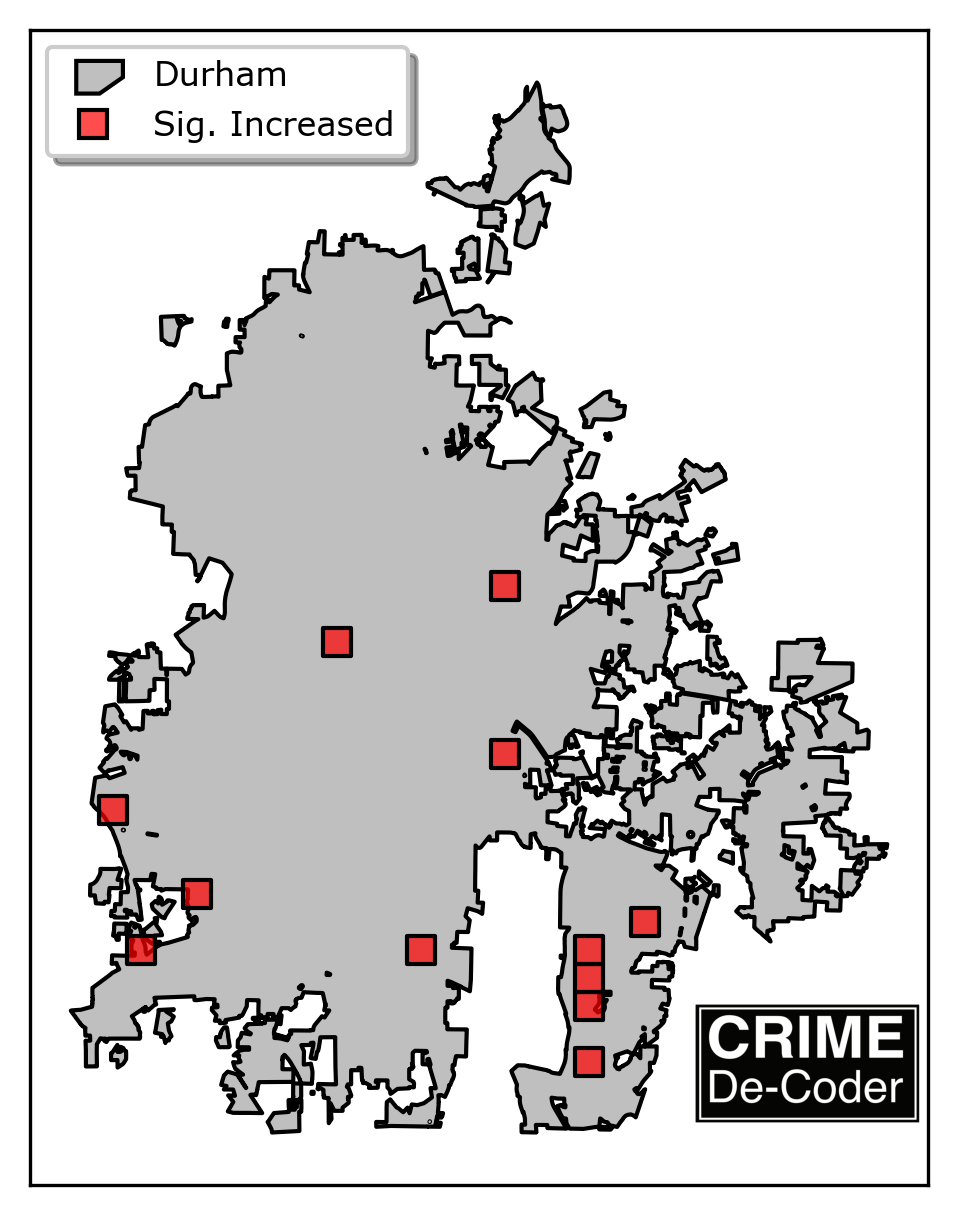
So even though the grid area that went from 1 to 19 is not the highest crime area, that would be a good location to see what changed in the past year that prompted those increases. Such as a single group repeatedly breaking into cars.
References
Wheeler, A. P., Steenbeek, W., & Andresen, M. A. (2018). Testing for similarity in area‐based spatial patterns: Alternative methods to Andresen’s spatial point pattern test. Transactions in GIS, 22(3), 760-774. Preprint
Wheeler, A. P., Worden, R. E., & McLean, S. J. (2016). Replicating group-based trajectory models of crime at micro-places in Albany, NY. Journal of Quantitative Criminology, 32(4), 589-612. Preprint