Notes on Crime Trends in the US
I was recently quoted in a NOTUS article about crime trends in the US—specifically, that crime has been trending downward across all crime types, even during the Biden administration.
Here is the graph I used to make that determination.
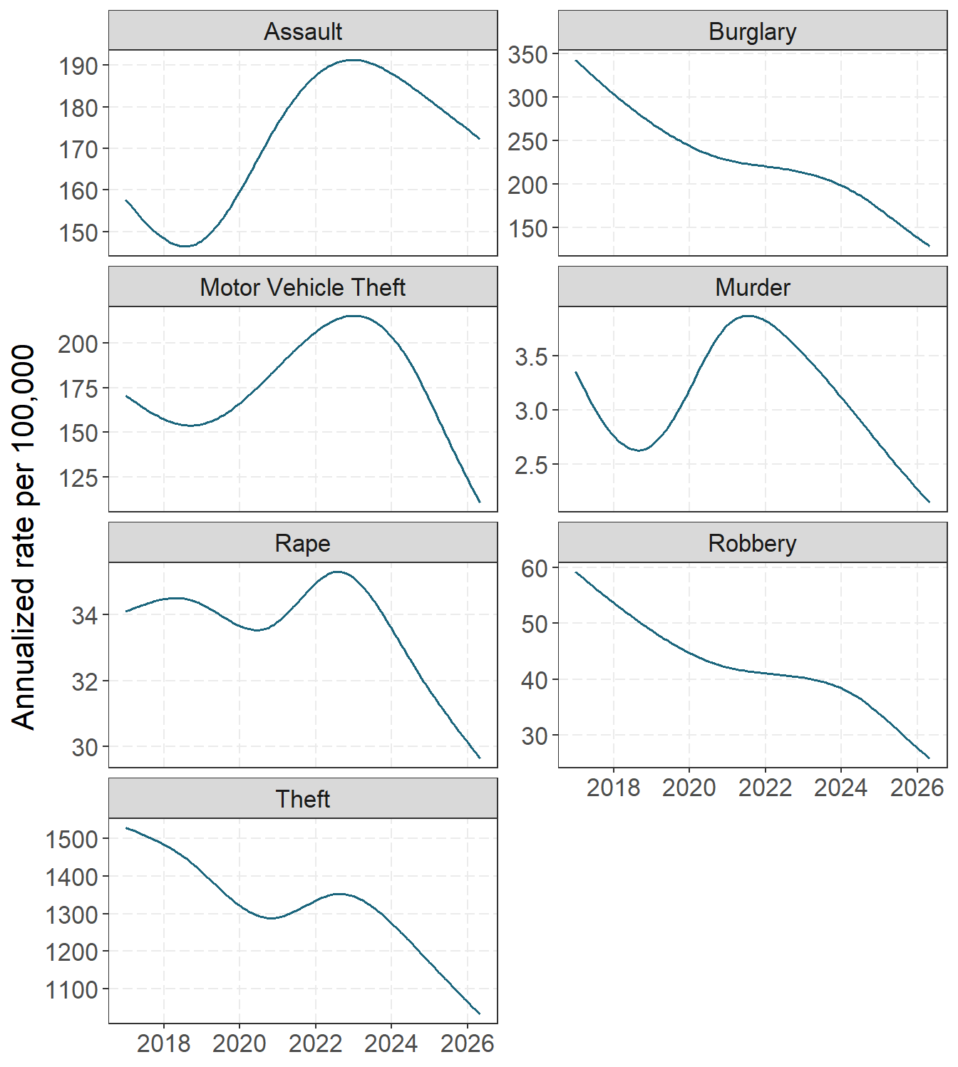
If you want to skip to the end, you can see the technical report I wrote on how I calculated those smooth trends (via the sample of cities in Jeff Asher’s Real Time Crime Index).
National politics, in my opinion, tend to have little to nothing to do with local crime trends. But there are definitely national crime trends. Here are my notes for others to follow along, as well as a description of statistical models to estimate those national trends and identify local deviations from those trends.
Cities Share a Common US Trend
When I used to teach, I shared this graph with students to illustrate that there were shared national trends. The following graph shows homicide trends over time in Dallas, New York City, and Chicago:
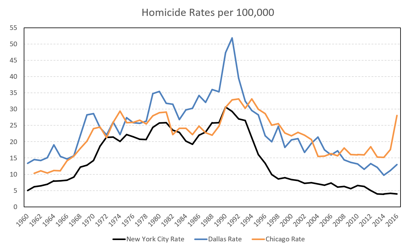
Although the three cities are far apart, you can clearly see that they followed similar patterns: an increase from the 1960s to the early 1990s, potentially with a flat period from the mid-1970s through the 1980s, followed by a crime decline beginning in the early 1990s. The cities may shift the pattern by a few years and show level shifts up or down (Dallas has always been higher than New York City), but they generally follow similar trends over time. This pattern was shared across many cities, not just these three.
The cities can simultaneously have bumps, like Chicago did in 2016. We will want to model that national trend, but also allow the model to vary enough to identify those level differences between cities, as well as bumps when they diverge from those overall trends.
Breaking Down into Trend and Season with Subannual Data
When looking at crime data at subannual intervals, you can often see regular ups and downs. A convenient way to analyze a time series with regular seasonal patterns is to separate it into seasonal, trend, and residual components.
Here is an example of burglaries in the US, based on the sample of agencies collected by the Real Time Crime Index (RTCI). The first panel shows the actual observed counts1, and the panels below show statistical estimates of the overall trend, the regular seasonal component, and the residual.
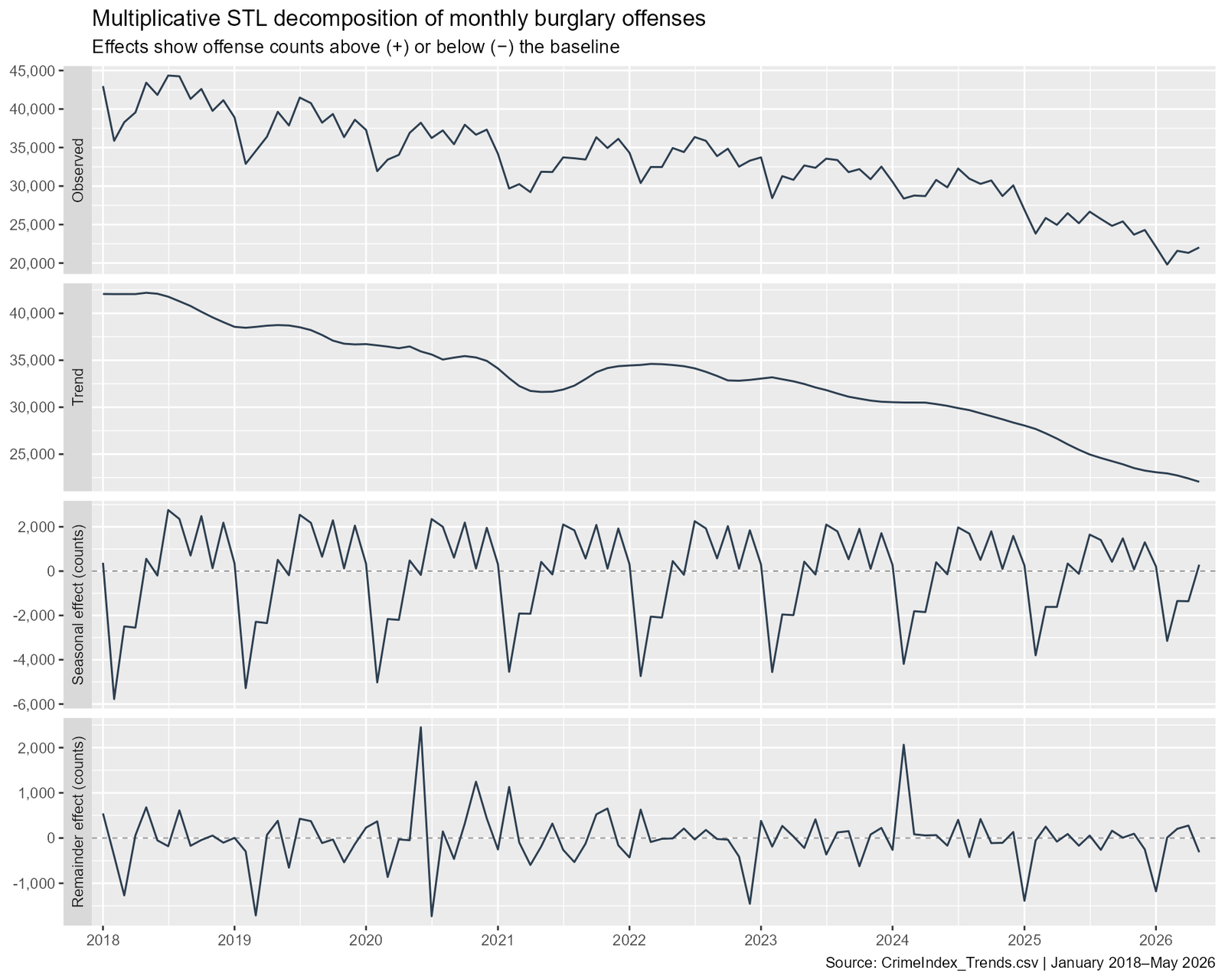
So this shows a fairly smooth decline over time after filtering out the seasonal component. This is for the cumulative burglary data (from the RTCI), but I fit a model that basically estimates this for every city in the RTCI. I do not want to get too much into the technical details, but I fit a random effects logistic regression model for the rates, so it takes into account that some cities’ rates are more volatile due to smaller population counts. Again, all code to replicate the graphs is on GitHub.
The trend and seasonal components are calculated via splines and multiple Fourier terms, respectively. I then have global terms for these (which characterize the entire US) and city terms (so you can look at deviations from the average). In the logit model, you can explicitly model the residual term, so you can get a standard error for the residual effect.
Here I am going to walk through one city estimate, Philadelphia, as an example. Here are Philadelphia’s observed data (light gray), fitted trend and season (orange line), and the US average trend and season (blue line). They appear in sync in both trend and season, although Philadelphia has an upward level shift. You can also see some spikes in Philadelphia’s observed data relative to the smoothed data.

The next figure shows the STL-type chart but compares the trend and seasonal components in a way that makes their scales similar, making changes in the shapes of the curves easier to see while ignoring the level shift.
This lets you compare the global trend, seasonal, and residual components (blue) with Philadelphia’s estimated components. For the trend and seasonal components, I plot Philadelphia’s estimates with standard errors, making it easier to identify significant differences by eye. Philadelphia’s long-term trend is somewhat flatter than the national decline in burglary rates. Its seasonal component is very similar to the national pattern.

In the residual chart, you can see a large spike in 2020 (which happened to correspond to a few extra hundred commercial burglaries related to the George Floyd protests).
While the report just has this example for Philadelphia, I have a web app you can filter for individual cities and get these same graphs and stats for any city of interest.

Looking at Deviations from National
Via the model, I can look at the trends or seasonal components that vary from the national curve. Here is a graph of violent crime trends:

This identifies Baltimore’s violent crime trend as declining more than the US trend would suggest, consistent with several of the initiatives Mayor Brandon Scott has implemented.
If you look at trends in property crimes, you see a few that buck the national decline. Thefts are rising in Vallejo.

The paper also shows deviations from the seasonal trend, but they are a bit boring. Some places have steeper seasonal patterns than the national average, but otherwise they are unremarkable.

Looking at Outliers
More interestingly, the model can identify individual months that are outliers. Looking at the historical data, here are the largest outliers for violent crime.

The high murder count in San Antonio was due to the mass-fatality event in which 53 migrants died in a truck. The model predicted 19.7 murders in that month, while 71 were observed. (Absent the mass-fatality event, there would have been 18 murders.) Looking at the same chart for property crimes, we see consistently large numbers of crimes in Bismarck, North Dakota, in May 2025:

If we compare the model’s predictions with the observed values, we can see an almost tenfold increase across several different crime categories in that month. So these are likely data errors.
| Offense | City | Month | e | Pred. n | Obs. n |
|---|---|---|---|---|---|
| Rape | Bismarck, ND | 05/25 | +0.6 | 4.8 | 39 |
| Assault | Bismarck, ND | 05/25 | +1.3 | 15.1 | 101 |
| Burglary | Bismarck, ND | 05/25 | +1.9 | 18.5 | 165 |
| Theft | Bismarck, ND | 05/25 | +1.6 | 131.9 | 772 |
| Motor Vehicle Theft | Bismarck, ND | 05/25 | +1.6 | 15.3 | 114 |
While this is useful for data collectors (to correct errors), it is likely more useful for those monitoring crime patterns to see the most recent data and identify outliers.
Here is a table of the two largest outliers for each crime type in the most recent month of data (which, for RTCI, is currently May 2026).
| Offense | City | e | SE(e) | Pred. n | Obs. n | Pred. rate | Obs. rate |
|---|---|---|---|---|---|---|---|
| Murder | St. Louis, MO | +0.17 | 0.15 | 13.7 | 22 | 59.8 | 96.1 |
| Murder | Fort Wayne, IN | +0.15 | 0.16 | 2.5 | 8 | 10.9 | 34.9 |
| Rape | Houston, TX | +0.19 | 0.09 | 88.2 | 117 | 43.9 | 58.2 |
| Rape | Bakersfield, CA | +0.19 | 0.13 | 7.3 | 19 | 20.8 | 54.2 |
| Robbery | Washington, DC | +0.30 | 0.09 | 79.6 | 126 | 137.7 | 218.0 |
| Robbery | Little Rock, AR | -0.21 | 0.11 | 25.5 | 7 | 148.8 | 40.9 |
| Assault | Indianapolis, IN | -0.46 | 0.09 | 373.7 | 219 | 496.2 | 290.8 |
| Assault | Fayetteville, NC | -0.43 | 0.14 | 39.5 | 11 | 226.9 | 63.1 |
| Burglary | Roanoke, VA | +0.99 | 0.13 | 33.3 | 112 | 409.3 | 1375.9 |
| Burglary | Portsmouth, VA | +0.80 | 0.13 | 42.4 | 113 | 528.0 | 1407.2 |
| Theft | Fayetteville, NC | -0.70 | 0.10 | 95.7 | 7 | 549.3 | 40.2 |
| Theft | Medford, OR | -0.55 | 0.09 | 212.2 | 91 | 2951.3 | 1265.4 |
| Motor Vehicle Theft | Tucson, AZ | -0.65 | 0.14 | 69.1 | 19 | 148.9 | 40.9 |
| Motor Vehicle Theft | Milwaukee, WI | -0.44 | 0.10 | 407.2 | 251 | 873.1 | 538.1 |
Given the standard error of the e term, you can distinguish actual outliers from normal variation: if the term is more than twice its standard error, it is an outlier worth noting. Here, murder counts in St. Louis and Fort Wayne were high in May, but they were within the expected variation. Robberies in Washington, DC, were slightly higher than the model would predict in May (126 observed versus 80 predicted).
Burglaries are quite a bit higher in Portsmouth and Roanoke, Virginia. Charts like these could be useful for identifying broader emerging trends, like the Kia Boys motor vehicle theft trend. While these two cities are quite far apart, I am aware of criminal groups traveling between New York City and upstate New York, so a common group of burglars causing the uptick in both is not totally implausible.
There are also precipitous declines in thefts and motor vehicle thefts across several jurisdictions in the US. These could be data errors, but they could also signal interventions worth investigating in other jurisdictions.
Check your own city out
If you missed it, you can check out an interactive application to filter to your own city. I will continue to update that with new data when the RTCI updates.
It lets you filter for individual cities or view smooth curves for national and city-level trends. You can look at the overall graph of city-level trends and spot any anomalies.
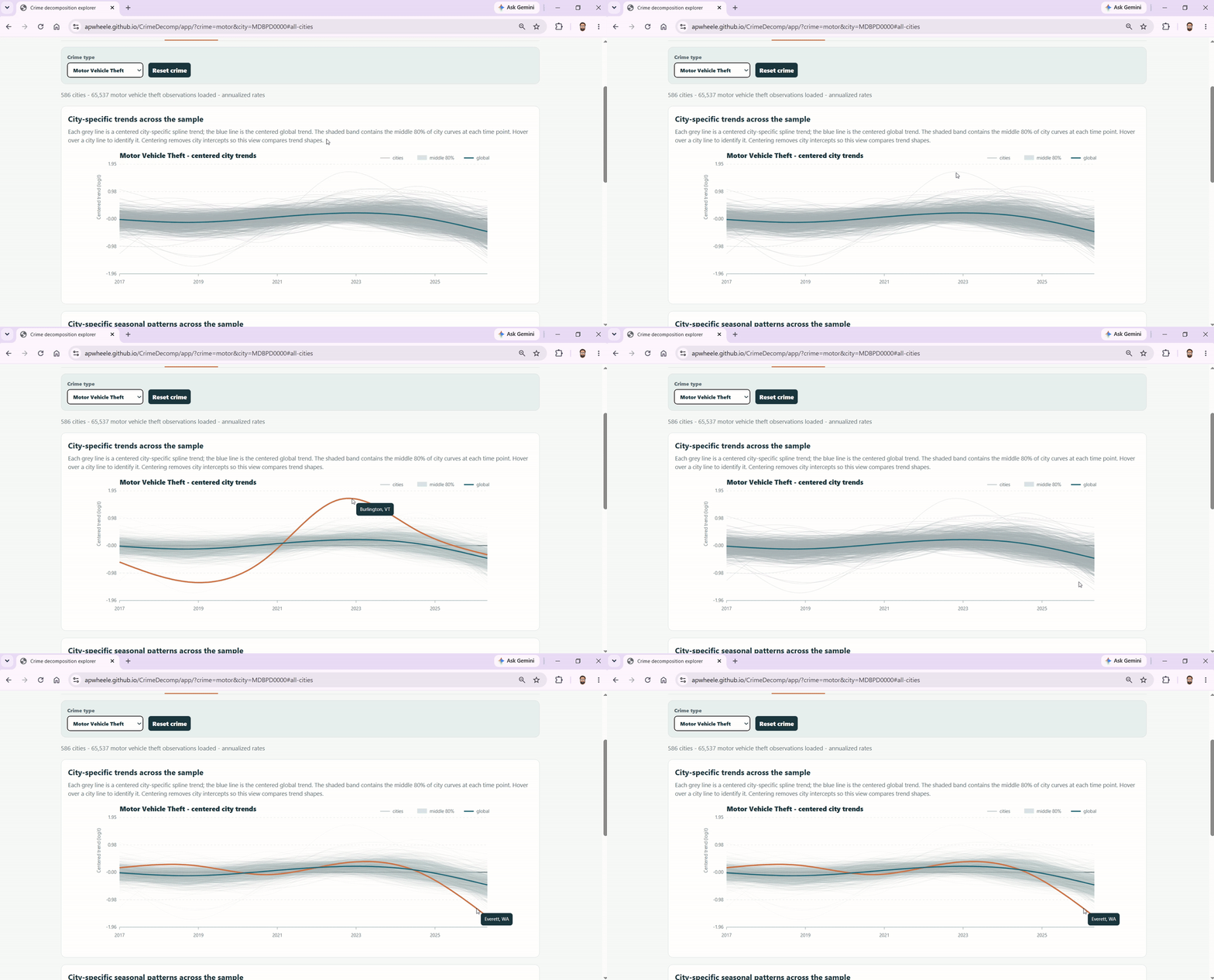
You can also do the same type of analysis with the residuals.
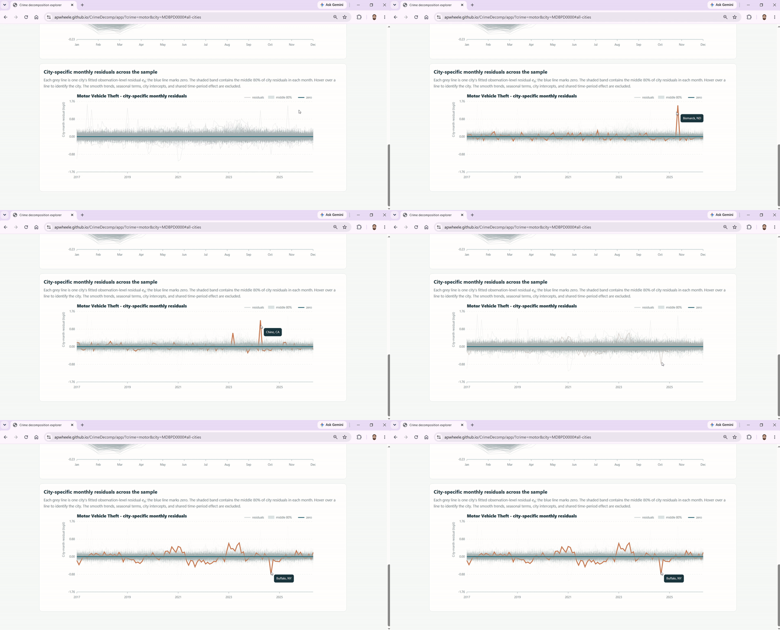
So between those graphs, you can identify major trends and spikes worth looking into more closely by jurisdiction across all crime types.