A graph is worth 1000 tables
I have previously written about how in CompStat reporting, you should not use percent change. For a refresher, here is the template from the NYPD that many cities replicate when reporting crime statistics:

But similar to the saying a picture is worth 1000 words, there is only so much information you can pack into what are essentially two numbers (a pre and post count of crime). So in addition to the fact that percent change should be retired, you should also include time series graphs in your CompStat report.
There are two common reasons police departments want to examine crime trends. One is to identify if crime is spiking, e.g. this week had 5 robberies, is that normal? Even in large cities, a single prolific offender can go on a spree and noticeably impact citywide crime statistics.
The second reason is to identify longer term trends. Crime can be smoothly trending upwards or downwards. If upwards, this suggests it is not due to one prolific individual, but a broader pattern of increased criminality. Like when motor vehicle thefts exploded due to the hack of Kia’s and Hyundai’s. If downwards, it can be evidence you are doing something right (or in some occasions there are anomalies in reporting).
Well executed charts can identify between these two specific scenarios in ways that a table of two numbers cannot. Here I will show a few of my favorite examples, using robberies from Chicago as an example.
Weekly Poisson Z-score chart
The first is a smoothed chart of crimes at the weekly level.

The idea behind this chart is to identify if there is a short term spike at the very end of the series. If the latest week is outside of the error bands, this indicates
Simultaneously, you can identify longer term upward and downward trends in this chart. Here we can see robberies in Chicago were increasing from the summer until around October in 2023. After that, there were downward trends into one regine of around 150-200 robberies per week in 2024, and then another downward shift of around 100-150 robberies per week in 2025.
The way to draw this chart is to to first aggregate crimes to the weekly level. The second step is to then calculate a smooth mean of the prior 8 weeks (8 weeks is ad-hoc, but tends to work well in my experience). The final is to draw the error bands (based on my Poisson Z-score).
This chart can be confusing though for data that shows strong seasonal patters, such as always rising in summer and falling in winter. So I suggest pairing this chart with another chart where it is easier to understand those typical ups-and-downs.
Seasonal Monthly Chart
The next chart I like to show is a monthly seasonal chart.
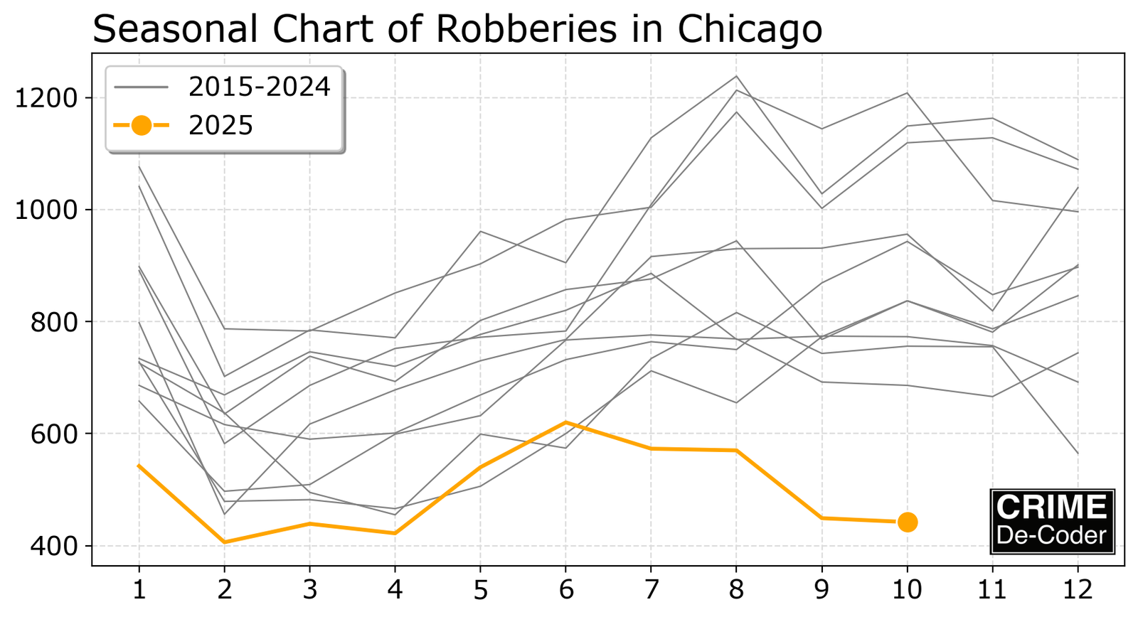
The X axis in the chart are the months, and the Y axis are counts per month. Each year then gets its own line. Many times, individuals draw each year as a different color, but that can be very distracting, so it is easier to draw the prior years as lighter grey lines, and the current year as a color.
This will show both seasonal patterns, those regular ups and downs during different months, as well as whether the current year is a high or low outlier.
For reference for a more typical monthly chart, here is what the Chicago data looks like just drawing a long graph of robbery counts by month and year.
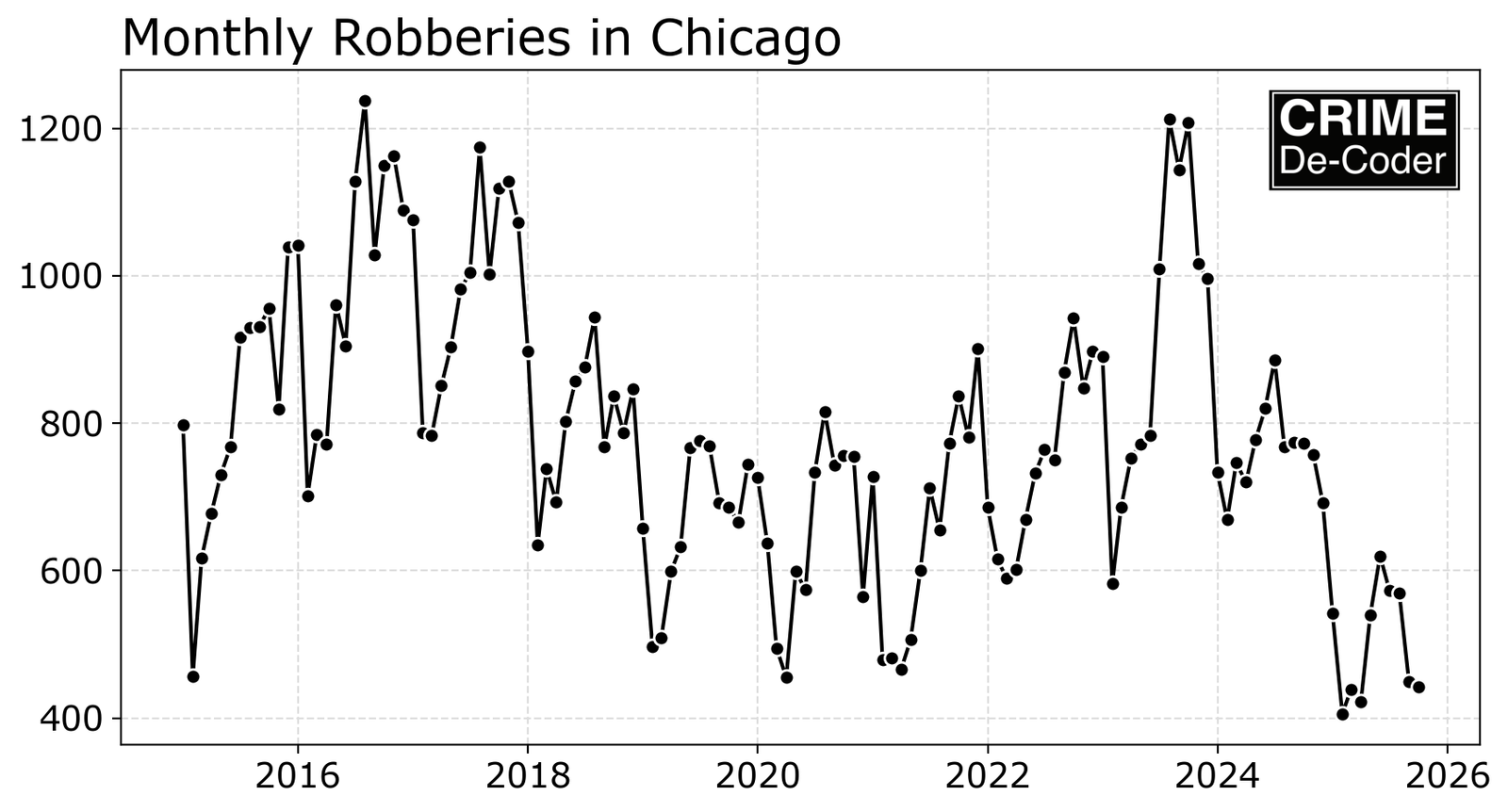
Although it is clear the most recent year is quite a bit lower in Chicago going back 10 years, what is not apparent is that the seasonality has shifted. Many of the prior years peaked in October, but 2024 and 2025 show peaks earlier in June (but at a lower magnitude). That shift is much easier to see in the seasonal chart, and the magnitude of it being an outlier (~200 crimes lower) is easier to see in the seasonal chart.
Replicating the Work
I have various resources showing how to replicate this work. These include:
- Tutorial in Excel using Slicers
- My crimepy python library
- My Dallas demo dashboard is a WASM application (built with python and the
panellibrary, so you can see the entire source how the Poisson Z-score graph is generated).
And for a reference and more details on the Poisson Z-score, you can check out my journal article:
- Wheeler, A. P. (2016). Tables and graphs for monitoring temporal crime trends: Translating theory into practical crime analysis advice. International Journal of Police Science & Management, 18(3), 159-172. Preprint