Finding outliers in proportions
Imagine you are evaluating how often officers give warnings vs tickets. The overall rate of giving warnings is 50%, and you want to identify when officers are either giving too many tickets or too many warnings. A common way you might try to identify officers who are outliers are simply calculating the proportion, and then sorting the table. But imagine you had a scenario like below:
- Officer A, warnings in 3 out of 10 stops
- Officer B, warnings in 30 out of 100 stops
They each have the same proportion of warnings, 30%. But Officer B is much better evidence of being an outlier, due to the larger number of stops. My favorite way to quantify this is via a funnel chart. For a funnel chart, you place the denominator count on the X axis, and the proportion on the Y axis. If the scatter spans varying denominators, you will get a funnel like pattern:
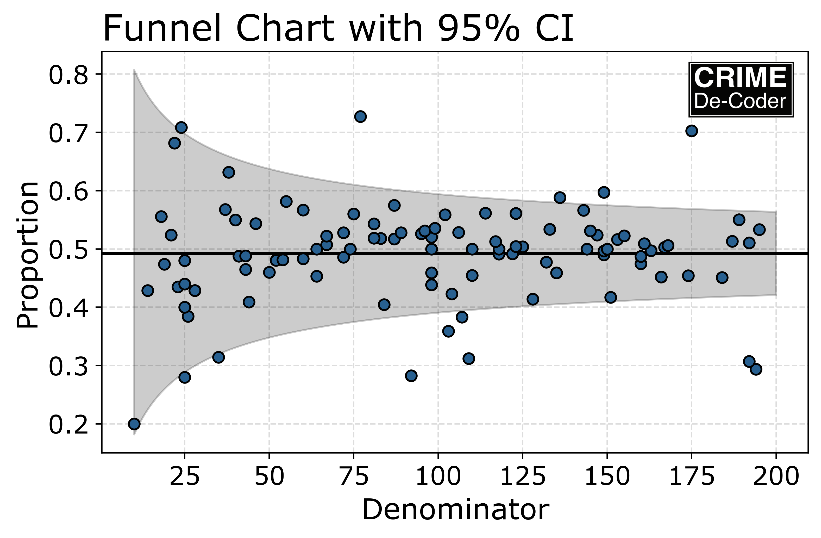
When considering the sampling variation, 3/10 is not an outlier (it is within the grey bands), but 30/100 is an outlier. The band gets smaller when you observe more data.
To show how to calculdate these bands, I use python to simulate some data. You can see the full code on Github. Below I first simulate data, with 95 individuals that I call normal (have an average proportion of warnings of 50%). And then I have 6 individuals that have low proportions of 30%, and 3 people with high proportions of 70%. For the denominator, I draw integers that a uniformly distributed between 10 and 200 observations, and then I generate binomial draws according to the individuals underlying proportion.
import cdcplot as cdc # my plot functions, template
import matplotlib.pyplot as plt
import numpy as np
import pandas as pd
from scipy.stats import beta

np.random.seed(10)

# simulate data, good/normal/bad
sim = {'normal': [95, 0.5],
       'bad': [6, 0.3],
       'good': [3, 0.7],}

# how many observations
low, hig = 10, 200

data = []
for k,v in sim.items():
    n = np.random.randint(low,hig,v[0])
    d = np.random.binomial(n,v[1])
    df = pd.DataFrame(zip(n,d),columns=['Den','Num'])
    df['group'] = k
    data.append(df)

data = pd.concat(data)
data['prop'] = data['Num']/data['Den']
overprop = data['Num'].sum()/data['Den'].sum() # overall proportion

print(f'Overall proportion in the sample is {overprop:.2f}')
data.sort_values(by='prop',inplace=True)
data # sorting gets a few outliers
This shows that by the simplest method, sorting, you get several of the normal samples with small denominators that have lower proportions compared to the bad samples. By luck of the draw, the good samples are all sorted to the bottom of the list:

Next I show a function to calculate a confidence interval around the proportion, there are multiple methods to do this, I like using the Clopper-Pearson method (as it works for very small proportions).
# low and upper bounds binomial confidence interval, Clopper-Pearson exact
def binom_int(num,den, confint=0.95):
    quant = (1 - confint)/2.
    low = beta.ppf(quant, num, den - num + 1)
    high = beta.ppf(1 - quant, num + 1, den - num)
    return (np.nan_to_num(low), np.where(np.isnan(high), 1, high))

# This estimates where the funnel should be based on the overall proportion
# in your data
lo, ho = binom_int(data['Den']*overprop,data['Den'])
data['lowt'] = lo
data['higt'] = ho

lv = data['prop'] < data['lowt']
hv = data['prop'] > data['higt']
data['flag'] = lv*-1 + hv*1

# A few false positives and one false negative
data[(data['flag'] != 0) | (data['group'] != 'normal')]
And this shows that we have a five false positives, but only one false negative. With a 95% confidence interval and 95 normal cases, our expected number of false positives is 4.75, so this is a pretty on the money example of the technique.

To draw the chart, I create a background funnel, then superimpose the observed points on the chart. This shows that many of the false positives are only just outside the error intervals. (So using a technique like increasing the confidence interval percentage, or conducting a false discovery rate correction would likely prevent most the false positives in this sample.)
x = np.linspace(low,hig,300)
lw,hi = binom_int(x*overprop,x)

fig, ax = plt.subplots(figsize=(7,4))
ax.fill_between(x,lw,hi,alpha=0.2, color='k')
ax.axhline(overprop,color='k',linewidth=2)
ax.plot(data['Den'],data['prop'],'o',markeredgecolor='k')
ax.set_xlabel("Denominator")
ax.set_ylabel("Proportion")
ax.set_title('Funnel Chart with 95% CI')
cdc.add_logo(ax, loc=[0.83,0.83], size=0.15)
plt.savefig('FunnelProportion.png',dpi=500, bbox_inches='tight')
For other examples of where crime analysts may be interested in using such charts:
- For state agencies examining crime rates across multiple jurisdictions (such as homicides)
- For public groups examining use of force at the agency level (see example for New Jersey use of force)
- Examining use of force for individuals (like is done for Early Intervention Systems), this is a better approach than the 3 strikes you are flagged (which dings more active officers)
For analysts interested in learning more python, check out my book or my training services. For departments interested in building internal tools, like an Early Intervention System, get in touch to see how Crime De-Coder can help.